Grid It - How to create responsive content with CSS Grid and Media Queries
Intro
Media queries are used to create responsiv layouts on Web pages. With CSS Grid in combination with media queries it is very easy to write a responsive code. This short tutorial shows you how to do this.
How to
CCSS-Grid has a big advantage when it comes to developing layouts for different screen sizes.
Each area can be completely rearranged with css.
All you have to do is pack your code into media queries. Within these queries you have to
change the grid-template-columns and grid-template-rows of the wrapper and the grid-area numbers of the areas.
But let's have a look at an example.
 <style>
 .wrapper {
display: grid;
grid-row-gap: 5px;
grid-column-gap: 5px;
grid-template-columns: 1fr 1fr 1fr;
grid-template-row: 1fr 1fr 1fr;
}

.header_left {
grid-area: 1 / 1 / 2 / 2;
}

.header_right {
grid-area: 1 / 2 / 2 / 4;
}

.aside {
grid-area: 2 / 3 / 4 / 4;
}

.main {
grid-area: 2 / 1 / 3 / 3;
}

.footer_left {
grid-area: 3 / 1 / 4 / 2;
}

.footer_right {
grid-area: 3 / 2 / 4 / 3;
}
</style>

<div class="wrapper">
<div class="header_1"></div>
<div class="header_2"></div>
<div class="asclasse"></div>
<div class="main"></div>
<div class="footer_1"></div>
<div class="footer_2"></div>
</div>
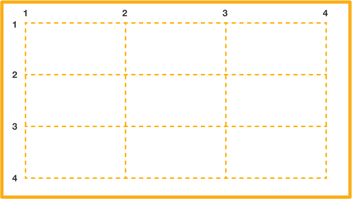
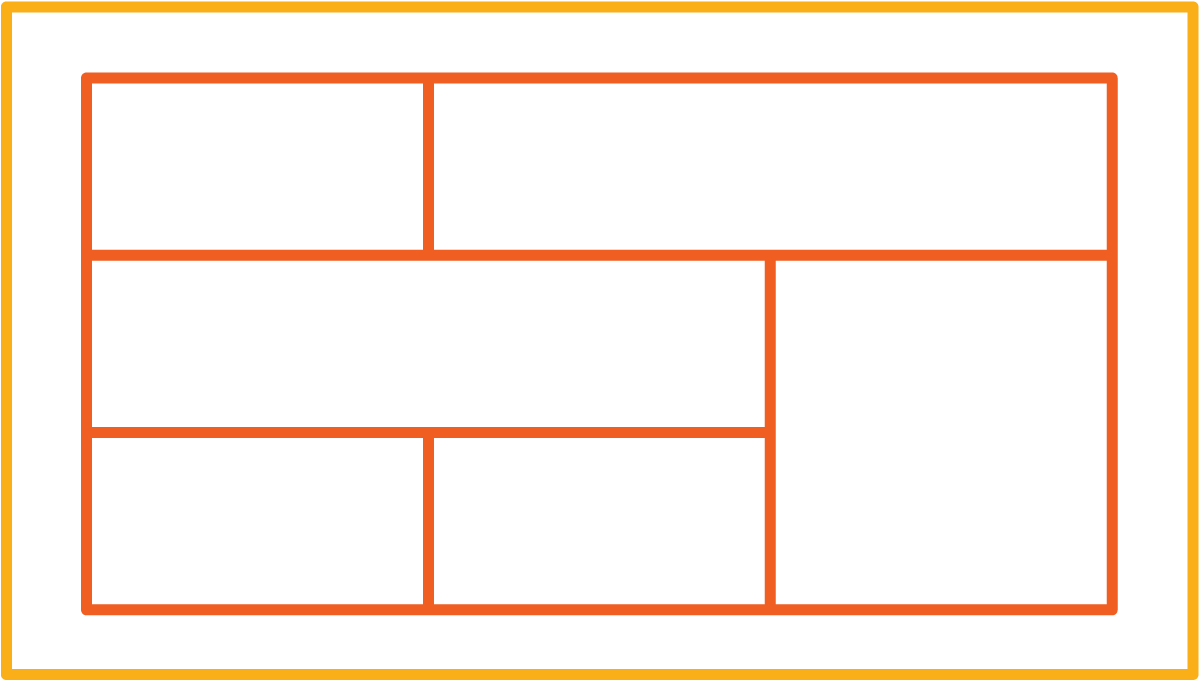
The areas are arranged according to the lines in the grid, in this order: grid-area: row-start / column-start / row-end / column-end.
So this is what this grid would look like on your website:
If this grid was to be filled with content, the space on a smartphone would be too small
for the entire content. The content must therefore be displayed differently on the smartphone.
This is where media queries come in.
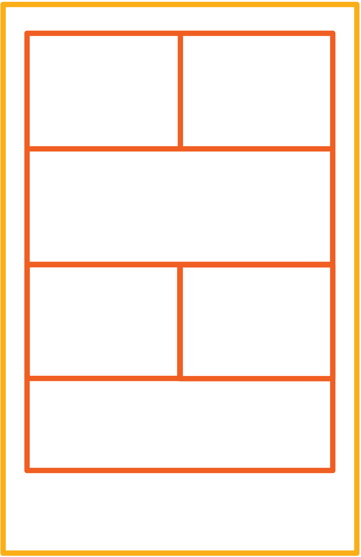
To display the grid in this image, you need to pack all your CSS code into a media query.
Then duplicate it and change the numbers in the media query. Now all you have to do for your grid to look
as good on smaller screens as on bigger screens, as said before, is to change the grid-template-columns
and grid-template-rows of the wrapper and the numbers in the grid-areas. The changes are highlighted
for better visibility.
@media only screen and (min-width: 768px) { /*change this number to whatever you want*/
 .wrapper {
display: grid;
grid-row-gap: 5px;
grid-column-gap: 5px;
grid-template-columns: 1fr 1fr 1fr;
grid-template-row: 1fr 1fr 1fr;
}

.header_left {
grid-area: 1 / 1 / 2 / 2;
}

.header_right {
grid-area: 1 / 2 / 2 / 4;
}

.aside {
grid-area: 2 / 3 / 4 / 4;
}

.main {
grid-area: 2 / 1 / 3 / 3;
}

.footer_left {
grid-area: 3 / 1 / 4 / 2;
}

.footer_right {
grid-area: 3 / 2 / 4 / 3;
}
}

@media only screen and (max-width: 767px) { /*change this number to whatever you want*/
 .wrapper {
display: grid;
grid-row-gap: 5px;
grid-column-gap: 5px;
grid-template-columns: 1fr 1fr;
grid-template-row: 1fr 1fr 1fr 1fr;
}

.header_left {
grid-area: 1 / 1 / 2 / 2;
}

.header_right {
grid-area: 1 / 2 / 2 / 3;
}

.aside {
grid-area: 3 / 2 / 4 / 3;
}

.main {
grid-area: 2 / 1 / 3 / 3;
}

.footer_left {
grid-area: 3 / 1 / 4 / 2;
}

.footer_right {
grid-area: 4 / 1 / 5 / 3;
}
}
The trick is to change the number of columns and rows. So for a smaller screen, you have fewer columns and more rows.
The grid-area of the different Areas must also change to adapt to the smaller number of columns.
You can add as many media queries as you want. For more adaptabiliy, add more media queries.
This tutorial shows only one way to work with the CSS grid in responsive web design. There are other possibilities.
For example, you could use grid-area on the wrapper and write in the names of the areas
as in an visual editor.
But this is the one you will need when working with Grid It.
More Information
More Information about the other way to create responsive Layouts I mentioned above.
It is also possible to create a responsive layout with CSS Grid without Media Queries. You can find
more informations about it here.